Tag Archives: text in photography

No message

I’ve been reading a little about the functions and mechanisms by which ‘signs’ (in the broadest sense of the word) operate. Icon, index and symbol, and the often impenetrable language of the semioticians. But some of the most obvious and bluntly direct signs are all around us in the form of advertising in public spaces as posters, advertising hoardings and billboards. In public urban spaces they are so ubiquitous that most of the time we don’t even notice their presence.

I have been looking at a lot of them lately, both in downtown locations and alongside highways, and I’ve been overwhelmed by the sheer number of them. Normally, they reach us (if at all) as just an element of background visual noise. Our gaze, the gaze of the contemporary citizen-consumer, both sophisticated and distracted, is usually directed elsewhere. Combating our neglectful tendency to ignore, these signs vie for attention through size, shock, visibility, repetition or saturated presentation. Through their style or location they attempt to reach (though ‘target’ is perhaps a better word for it) their desired audience/market segment.

Usually they are straightforward, even crude, in their expression of a simple message from the source (advertiser) to the recipient (viewer). The message is: “You need/want this product. Buy it.” Or:; “Change your behaviour or attitude take action in line with the advertiser’s wishes.”

No message

"No message" (5616 x 3744 pixels)

In this image of a standard (14′ by 48′) roadside image in a wilderness snowfield near Mt Kosciuszko, I wanted to make the billboard to itself become visible as an object, rather than as the almost-invisible vehicle for delivery of messages to a mass audience.  In a way it’s a McLuhan-esque effort to put the message to one side and focus solely on the medium.  I also sought to ask two questions of the viewer.

Firstly, if removed from its audience, and relocated in an environment without viewers, what happens to the sign? Does it continue to have meaning? It retains a physical presence and the capacity to express a message – but can it be said to have a message if it has no audience? This resembles the old pop-philosophical question:  if a tree falls in a wilderness forest with no-one there to hear it, does it make any noise?

It could of course be said that the billboard sign does have an audience i.e. us, the viewers of the reproduced photographic image. However we view only a picture of the billboard and its message. It is a ‘sign-within-a-sign’, or a ‘sign-about-a-sign’ i.e. a ‘meta-sign’. It is  at least one degree of abstraction removed from the ‘real’ sign and its message. (In fact it is even less than that, as it is only a contrived Photoshop 3D model of sign,  an ‘object’ which has never had existence in physical space!)

And the second question is: what might this then reveal about the mechanisms by which these objects function in their conventional human environment?

Text in photography

This post contains some thoughts on the incorporation of text in still photography, and was written as notes for my Private Thoughts in Public Places project.

Text and images have been combined in art since writing was first used. Written text was routinely combined with visual imagery in ancient Mesopotamia, Egypt, and Greece, and by artists from traditional Chinese calligraphers , to the creators of illuminated manuscripts in Middle Ages and Renaissance times. The text generally served to provide descriptive information or labels of the image content, or to impart messages of religious or political significance. The text generally formed an integral part of the artwork.

The incorporation of text in western art became less common in the succeeding centuries, but by the early 20th century (most notably amongst Cubist, Dadaist and Surrealist artists), text began to be employed to deliver conceptual messages, to amuse or to comment on the nature of art and the functions of language itself .

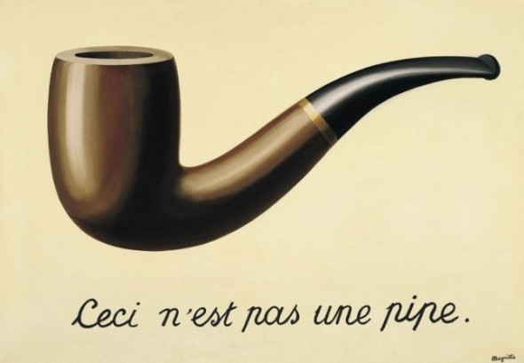
As well-known examples, René Magritte highlighted the difference between objects and their referents in The Treachery of Images (La trahison des images) (1928-29), and Marcel Duchamp played with language and visual puns in many of his works. His aim was to move from creation of art designed simply to provide visual enjoyment (which he termed ‘retinal art’) to art intended to engage and challenge the mind of the viewer, art in which the expression of ideas was paramount. Language formed a key part of that approach.

The Treachery of Images (1928-29). Rene Magritte


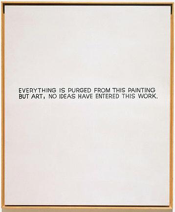
By the 1960s and early 1970s, some conceptual artists were producing work in which the use of text to deliver artistic content had entirely supplanted the visual elements of their work. This was no longer text in art, but text as art. For example John Baldessari, in his work of the late 1960s, famously sent his work out to be created by a local signwriter.

Everything is purged from this painting but art (1966-1968). John Baldessari


Pop art of the 1960s addressed the place of mass media in defining contemporary cultural identity, and postmodernist artists challenged the notion of the artist as author-creator. Both of these movements have made extensive use of text as a vehicle for expressing ideas about art and within artworks.

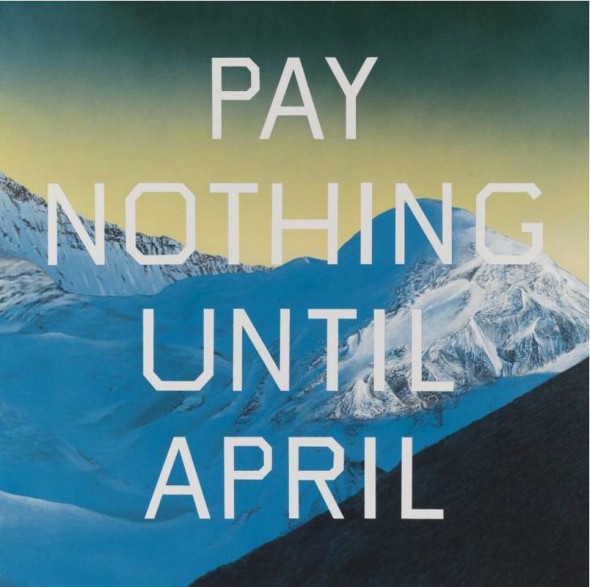
Pay nothing until April (2003). Ed Ruscha


Bruce Nauman has directly used text in his photographic and sculptural work, and based many of his images on visual puns (e.g. in “Bound to fail”). Ed Ruscha created series of ‘word paintings’ containing words (and later, phrases) for ironic or satirical effect.

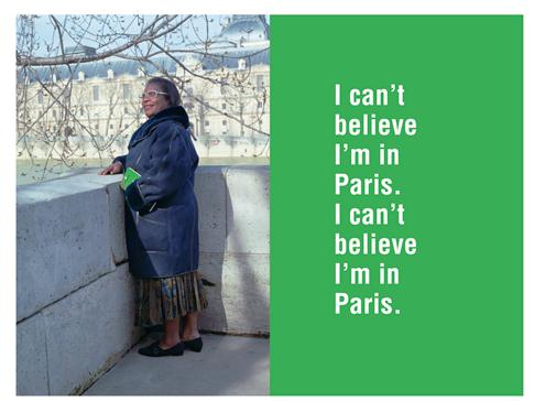
I can’t believe I’m in Paris (1995). Ken Lum

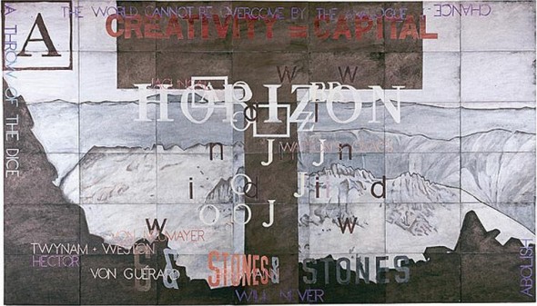
The View from K (1997-98). Imant Tillers


Contemporary culture is now saturated with images and text, often – or perhaps usually – in combination. The urban landscape, advertising, mass media, web content (even t-shirts!) all deliver information primarily in the form of text-plus-image packages. The incorporation of textual elements in visual art including fine art photography is now widely practiced to the point of being unremarkable. Artists as diverse as the Australian painter Imants Tillers and the Canadian photographer Ken Lum employ text as a key element within their practice – though in different ways and for quite different purposes.

In ‘theatrical’ films however the inclusion of text is (generally, and currently) less evident – apart from the standard inclusion of titles and credits to top-and-tail the work. One notable exception is the use of subtitles to provide simultaneous translation of foreign language films.

On occasion subtitles have been employed to provide an alternate text to the spoken words of the film. For example in Annie Hall (1979), Woody Allen used ‘discordant’ subtitles during a conversation between the Woody Allen character and Diane Keaton when they’re both trying to impress each other, while subtitles appear showing their true thoughts.

Annie Hall [still] (1979). Woody Allen. Spoken dialogue: “Photography’s interesting, ‘cause, you know, it’s a new art form, and a set of aesthetic criteria have not emerged yet.”

Annie Hall (1979). Woody Allen. Spoken dialogue: ‘Photography’s interesting, ‘cause, you know, it’s a new art form, and a set of aesthetic criteria have not emerged yet.’


In my Private Thoughts in Public Places project I have also sought to apply subtitle text for this purpose. The projection of this text out into the landscape (onto signs, buildings and the sky) is an extension of this approach, and an attempt to show that inner thoughts actually transform the thinker’s perception and mental construction of the landscape that they occupy. Unlike subtitles, the words are not merely a layer on top of the scene; they come to form a physical part of the environment itself.

Private Thoughts in Public Places

Private Thoughts in Public Places is a short (12 minute) video slideshow (with voices, music and subtitle text) which I prepared as a studio practice project for my studies at the ANU School or Art.

It aims to bring into stark relief the contrast between the ‘polite smalltalk’ of everyday conversation and the authentic inner dialogues that may be going on simultaneously. The ‘actors’ in the film portray people who are together in physical space – but isolated by the noise of their own inner worlds.

As the narrative progresses, the inner thoughts begin to leak out into the environment, with text appearing on signs, advertising billboards, graffiti – and eventually in the sky.

My intention was to explore storytelling through still photography, the presentation of photographs as a chronological sequence, the impact of incorporating text in visual imagery, showing motion with still images.

The project was planned as an investigation of several issues, each concerned with the viewer experience when presented with images in different ways:

• the impact of combining written text, spoken language and visual imagery;
• multiple related images presented in combination – adjacent versus consecutive presentation;
• the use of a sequential set of still images to present a narrative;
• the depiction of motion (both in time and space) through ‘still’ images;
• simultaneous presentation of different perspectives of a single event; and
• the (increasingly) ill-defined boundary between still and video imagery.

I really enjoyed this project, and anticipate doing more work in the future to further explore and develop the themes of this project. I think there’s more potential in the ‘private thoughts in public places’ concept, and in the projection of text into landscape images more generally. I’m also very interested in the use of variant media forms to package, present and deliver photographic images in different ways (to print, screen and web).

You can see a selection of still images from the project on the main Jokar web site by clicking on this link.