Mt Townsend

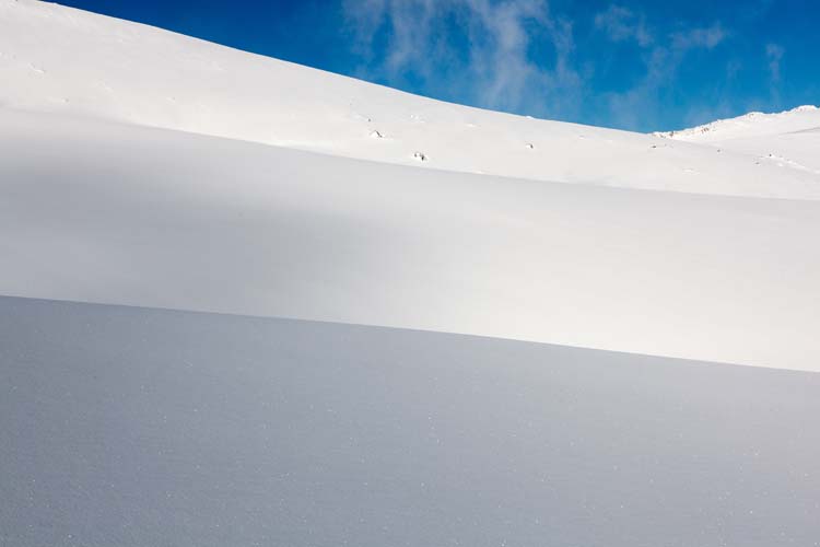
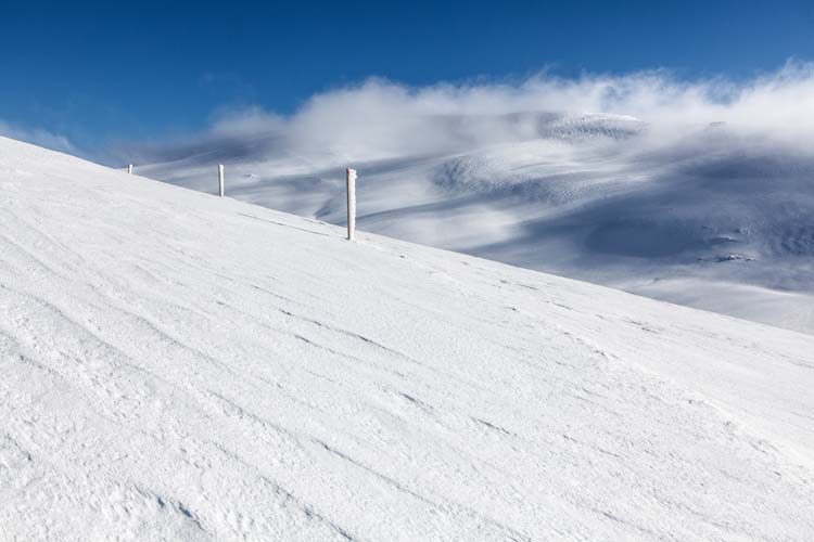
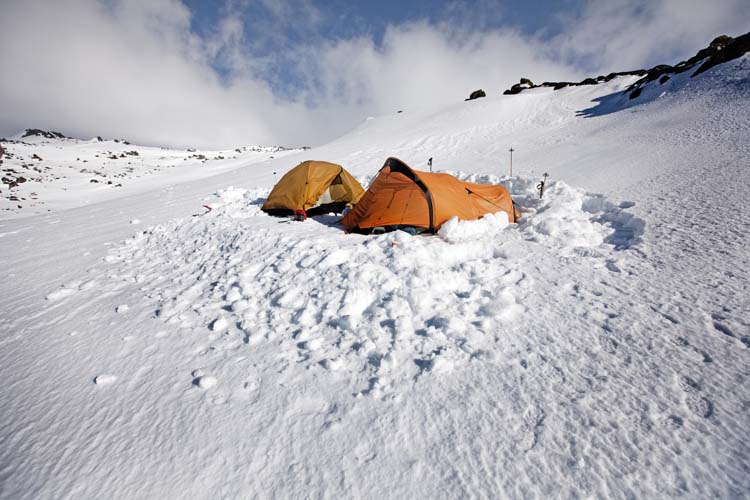
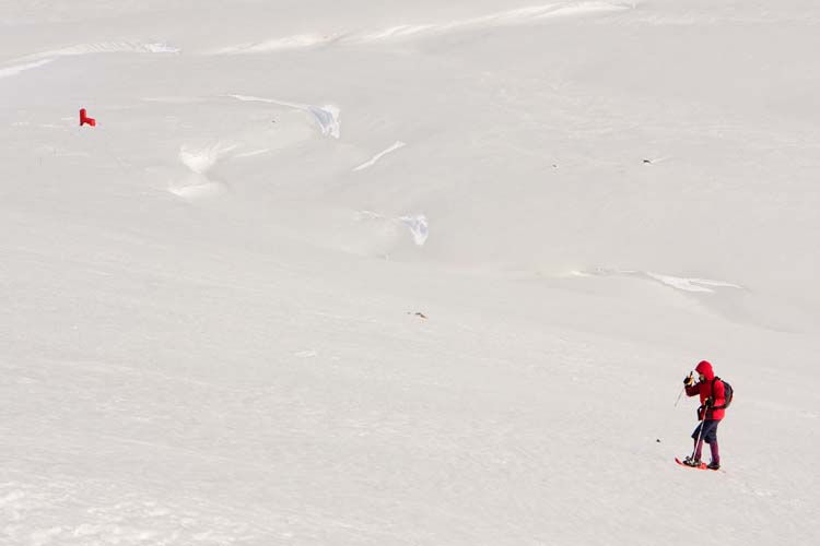
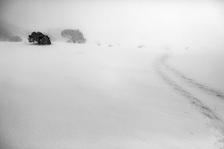
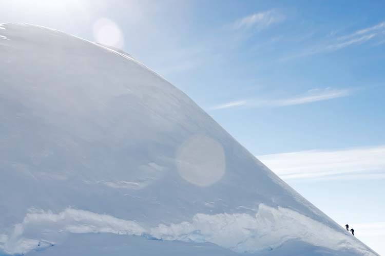
I had a great trip recently, snowshoeing from Crackenback (above Thredbo) to Mt Townsend. It was mid-week (no-one else out there), there had been about 20cm of fresh snow the night before (creamy smooth snow with no tracks) and the weather was glorious (sunny cold and some nice dark clouds coming in from the west during the afternoon).

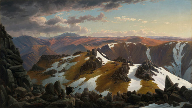
One purpose for the trip was reconnaissance; I have long admired Eugene Von Guerard’s painting Northeast View from the Northern Top of Mount Kosciusko (which is actually a view from the top of Mt Townsend).

It depicts a panoramic view from near the summit of Mt Townsend in the main range of the Snowy Mountains, looking northeast across Lake Albina and the Watsons Crags to Mt Twynam and Mt Jagungal in the distance. Shown in the central foreground are the members of German scientist Georg von Neumayer’s 1862 expedition team (including Hector the dog) which was undertaking a magnetic survey of the colony of Victoria. A storm, which later visited extreme and almost catastrophic conditions upon the party, can be seen approaching from the left background Apart from the pile of boulders in the left foreground, which do not exist in the actual location, the scene is shown with a fair degree of topographical accuracy

Eugene von Guérard, North-east view from the northern top of Mount Kosciusko (1863)

Eugene von Guérard, North-east view from the northern top of Mount Kosciusko (1863) - National Gallery of Australia

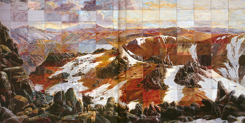
The painting was also appropriated by Imants Tillers in a 1985 painting (actually done as 165 separate canvas board panels) entitled Mount Analogue.Mount Analogue

Imants Tillers, Mount Analogue (1985) – National Gallery of Australia, purchased 1987. Painting, oil, oil stick and synthetic polymer paint. 279.0 h x 571.0 w cm

I’ve got this idea of reproducing this image as a photograph on 19 November this year – which will be exactly 150 years after Von Guerard was there. So part of my aim was to confirm the location of the painting’s vantage point, check lens options (I found the Canon 24-70 2.8L got the aspect about right) – and of course to make some images while I was there!

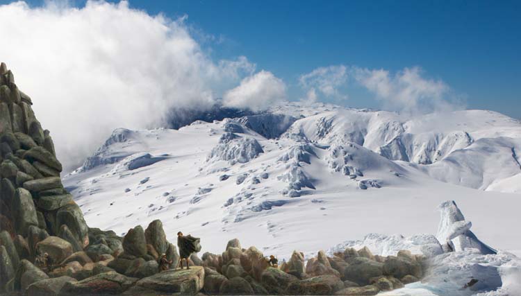
So here’s my mid-winter version of the scene (with the made-up bits of Von Guerard’s scene added in):Homage to Eugene Von Guerard and Imants Tillers

Homage to Eugene Von Guerard and Imants Tillers

The light was quite lovely the day I was there, especially as the clouds came up in the afternoon and chased me back to Crackenback, and I got nice images along the course of my 8 hours of tramping through the snow. I’ve reproduced a few of them below, but you can see the full set on the main Jokar web site at this link. Hope you like them!

Mt Townsend

Slopes of Muellers Peak

Descending from Mt Townsend

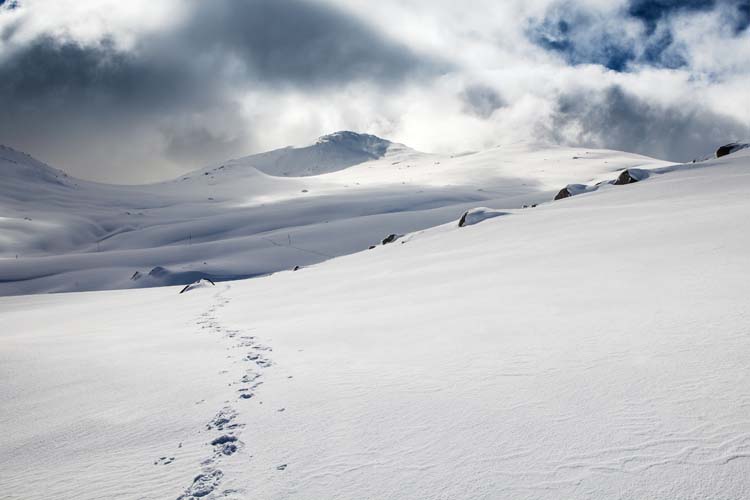
Looking back at Mt Townsend (my tracks in the snow)

Above Seaman's Hut

Between Seaman's Hut and Rawson Pass

Winter Postcards exhibition

PhotoAccess is currently showing an exhibition of work by no less than 32 photographers. It’s called Winter Postcards, and as the name suggests all of the works must be postcard size (i.e. 6″ x 4″), with each exhibitor able to show up to 10 images.

The brief for the exhibition is very broad, with the only requirements being that the images should relate somehow to the winter theme – even if they are images of travel to warmer climes to escape the chilly Canberra winter – and that each set of images should work as a group.

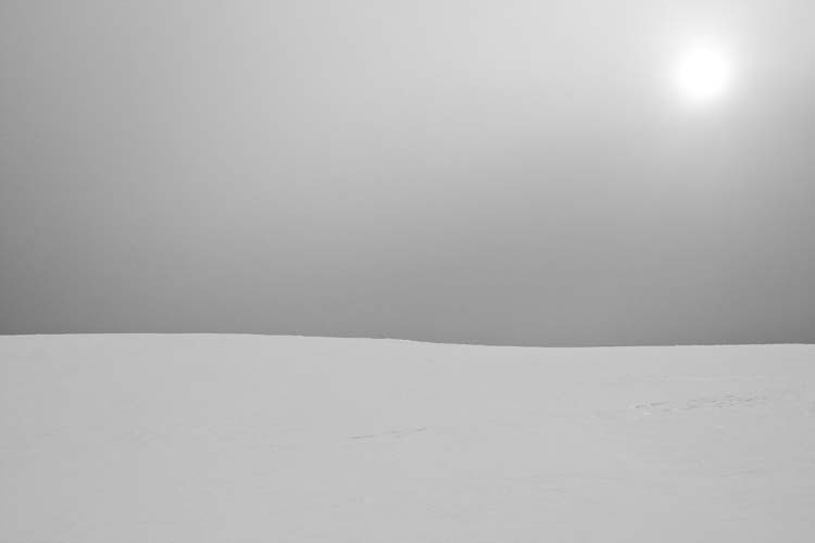
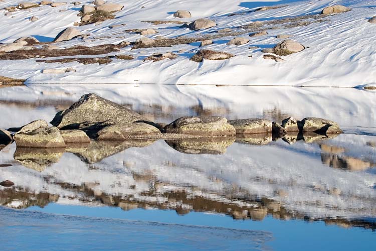
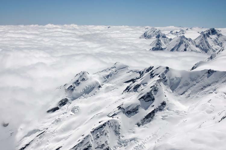
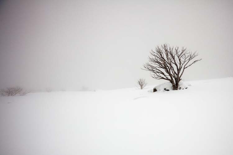
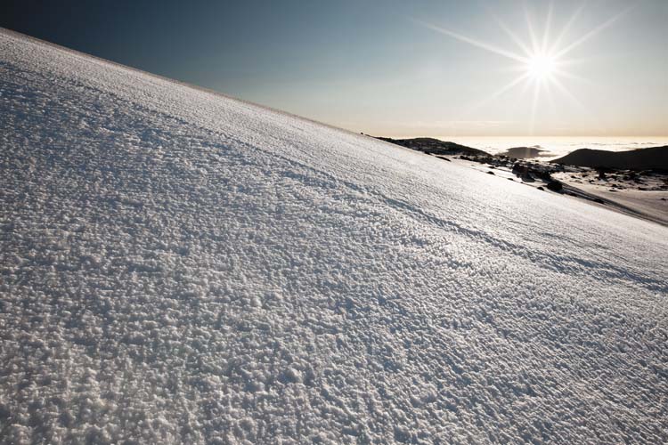
I submitted 10 images under the title of “Alpine“. They are all snowy landscape images, with signs of human presence in several of them. Most have been taken in the Snowy Mountains region at some point over the past several years, though there are also two from New Zealand, from when I did a mountaineering course there a few years ago.

Alpine 1 - Ramsheads campsite

Alpine 2 - near Kosciuszko, just before the storm arrived

Alpine 3 - Hedley Tarm reflections

Alpine 4 - Approaching Cootapatamba Hut

Alpine 5 - View from Kelman Hut (NZ)

Alpine 6 - snowshower below South Ramshead

Alpine 7 - early morning on Ramshead Range

Alpine 8 - snowshoe tracks below South Ramshead

Alpine 9 - snowgums near Mt Perisher

Alpine 10 - climbing Mt Aylmer (NZ)

The Winter Postcards exhibition is on at PhotoAccess until 12 August. More information at this link.

Text in photography

This post contains some thoughts on the incorporation of text in still photography, and was written as notes for my Private Thoughts in Public Places project.

Text and images have been combined in art since writing was first used. Written text was routinely combined with visual imagery in ancient Mesopotamia, Egypt, and Greece, and by artists from traditional Chinese calligraphers , to the creators of illuminated manuscripts in Middle Ages and Renaissance times. The text generally served to provide descriptive information or labels of the image content, or to impart messages of religious or political significance. The text generally formed an integral part of the artwork.

The incorporation of text in western art became less common in the succeeding centuries, but by the early 20th century (most notably amongst Cubist, Dadaist and Surrealist artists), text began to be employed to deliver conceptual messages, to amuse or to comment on the nature of art and the functions of language itself .

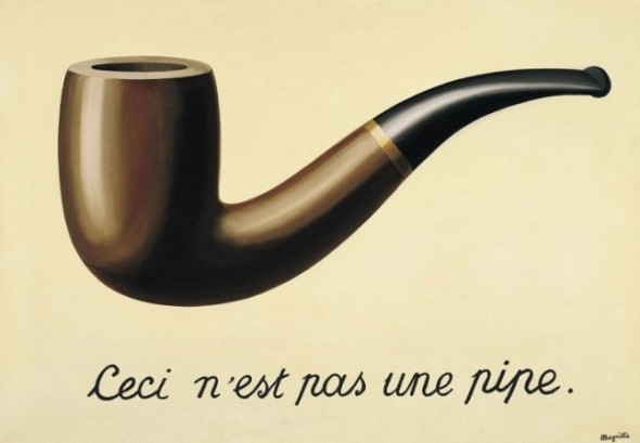
As well-known examples, René Magritte highlighted the difference between objects and their referents in The Treachery of Images (La trahison des images) (1928-29), and Marcel Duchamp played with language and visual puns in many of his works. His aim was to move from creation of art designed simply to provide visual enjoyment (which he termed ‘retinal art’) to art intended to engage and challenge the mind of the viewer, art in which the expression of ideas was paramount. Language formed a key part of that approach.

The Treachery of Images (1928-29). Rene Magritte


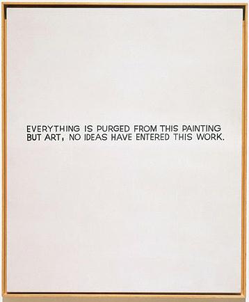
By the 1960s and early 1970s, some conceptual artists were producing work in which the use of text to deliver artistic content had entirely supplanted the visual elements of their work. This was no longer text in art, but text as art. For example John Baldessari, in his work of the late 1960s, famously sent his work out to be created by a local signwriter.

Everything is purged from this painting but art (1966-1968). John Baldessari


Pop art of the 1960s addressed the place of mass media in defining contemporary cultural identity, and postmodernist artists challenged the notion of the artist as author-creator. Both of these movements have made extensive use of text as a vehicle for expressing ideas about art and within artworks.

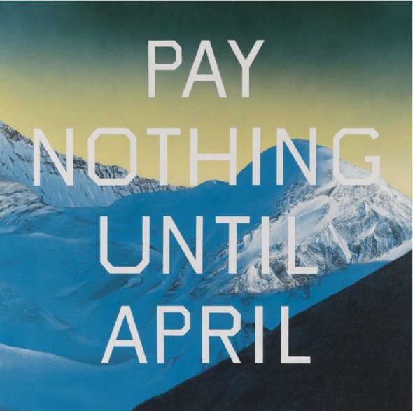
Pay nothing until April (2003). Ed Ruscha


Bruce Nauman has directly used text in his photographic and sculptural work, and based many of his images on visual puns (e.g. in “Bound to fail”). Ed Ruscha created series of ‘word paintings’ containing words (and later, phrases) for ironic or satirical effect.

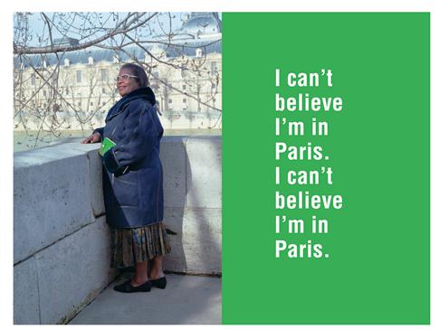
I can’t believe I’m in Paris (1995). Ken Lum

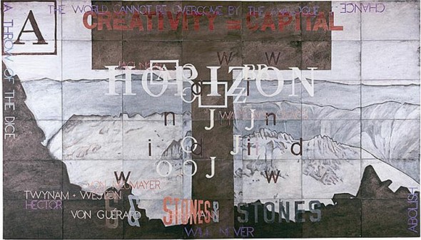
The View from K (1997-98). Imant Tillers


Contemporary culture is now saturated with images and text, often – or perhaps usually – in combination. The urban landscape, advertising, mass media, web content (even t-shirts!) all deliver information primarily in the form of text-plus-image packages. The incorporation of textual elements in visual art including fine art photography is now widely practiced to the point of being unremarkable. Artists as diverse as the Australian painter Imants Tillers and the Canadian photographer Ken Lum employ text as a key element within their practice – though in different ways and for quite different purposes.

In ‘theatrical’ films however the inclusion of text is (generally, and currently) less evident – apart from the standard inclusion of titles and credits to top-and-tail the work. One notable exception is the use of subtitles to provide simultaneous translation of foreign language films.

On occasion subtitles have been employed to provide an alternate text to the spoken words of the film. For example in Annie Hall (1979), Woody Allen used ‘discordant’ subtitles during a conversation between the Woody Allen character and Diane Keaton when they’re both trying to impress each other, while subtitles appear showing their true thoughts.

Annie Hall [still] (1979). Woody Allen. Spoken dialogue: “Photography’s interesting, ‘cause, you know, it’s a new art form, and a set of aesthetic criteria have not emerged yet.”

Annie Hall (1979). Woody Allen. Spoken dialogue: ‘Photography’s interesting, ‘cause, you know, it’s a new art form, and a set of aesthetic criteria have not emerged yet.’


In my Private Thoughts in Public Places project I have also sought to apply subtitle text for this purpose. The projection of this text out into the landscape (onto signs, buildings and the sky) is an extension of this approach, and an attempt to show that inner thoughts actually transform the thinker’s perception and mental construction of the landscape that they occupy. Unlike subtitles, the words are not merely a layer on top of the scene; they come to form a physical part of the environment itself.

Narrative in photography

This post contains some thoughts on the depiction of ‘narrative’ in still photography, and was written as notes for my Private Thoughts in Public Places project.

Photographers have sought to portray narrative in their work since the inception of the art. It is obviously inherently more difficult to depict narrative in the still image than in a motion picture, as “a film unfolds in time and a painting [or photograph] does not”.

Several techniques are commonly employed to create or imply a sense of unfolding narrative in still images:

  • Inclusion of objects in an image which indicate some antecedent or imminent event;
  • Depiction of two or more human subjects in a way that indicates relationship between them (or evidence of a 2nd person who may be outside of the frame);
  • Multiple related images presented as a chronologically ordered sequence;
  • For a longer sequence of storytelling images, the conventional structural ‘rules’ of short story or video may be applied.

In recent years many photographers have explicitly refrained from presenting a complete or detailed narrative, instead implying narrative or presenting an ambiguous narrative for the viewer to interpret as they choose. Gregory Crewdson sees photography as related to the narrative forms of writing and video, but he is drawn to “the idea of creating a moment that’s frozen and mute, that perhaps ultimately asks more questions than it answers, proposes an open-ended and ambiguous narrative that allows the viewer to, in a sense, complete it”.
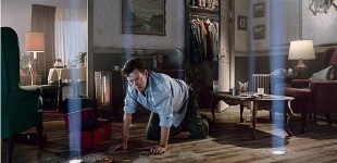
Untitled. Gregory Crewdson.


As Philip-Lorca diCorcia puts it: “the more specific the interpretation suggested by a picture, the less happy I am with it”. The subjects in his images do not engage directly with the camera, which enhances both the feeling of narrative and cinematic style of his images.
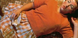
Untitled film still #96. Cindy Sherman

Similarly, in the work of Cindy Sherman (particularly in the Untitled film stills series) it is clear that one is viewing a scene from within a story, but without enough information to be certain of the story’s origin or outcome. The viewer is encouraged to develop their own narrative to explain the image.


This ‘less-is-more’ approach to exposition of narrative can engage the viewer more interactively with the image than if the story was fully resolved.
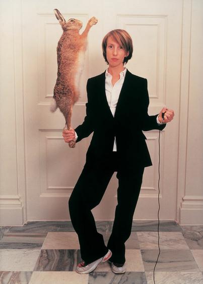
Self-portrait in a double-breasted suit with hare (2001). Sam Taylor-Wood

Sam Taylor-Wood goes further, constructing images (including large scale panoramas and videos) that take ambiguity to a level of possible incoherence. This is deliberate strategy: “you try to make associations between people and what they’re doing but you can’t necessarily find any narrative”. For the viewer, this can be unsettling… or unsatisfactory.
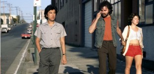
Mimic (1982). Jeff Wall


Jeff Wall has expressed doubt that still pictures can be narrative at all. “All they do is suggest what it might be like to experience the narrative. They don’t create one because they don’t have the ability. A narrative has to go in time and pictures can never do that.”

One approach to expression of narrative through still images is presenting a series of images in chronological sequence, as for example in many of the photographic series produced by Duane Michals.
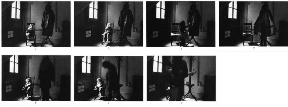
Bogeyman (1973). Duane Michals


Chris Marker’s science fiction short film La Jetée (1962) tells a detailed story through still images. The film (and it was made as a film in those pre-digital days) consists almost entirely of several hundred photographs displayed in sequence, with an overlaid audio narration of the story. Despite being made up of photos, it imparts a quite detailed plot, shows the passage of time, has character development, and shows physical movement at key moments – such as in the final scene where the central character runs across the viewing platform at Orly Airport.
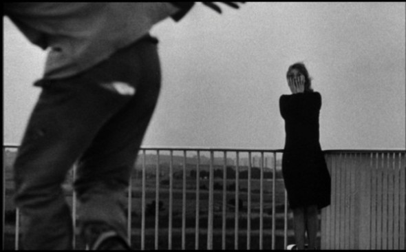
The experience of viewing La Jetée closely resembles the experience of narrative delivered through a motion picture. The story is thoroughly articulated (by way of the audio narration as much as the images), and the viewer is largely passive, and given little role in constructing the narrative.

Three decades later, La Jetée was released in a photo-book form, with all the same content (same set of images and text), but delivering a quite different experience to that of the film version. This is because the images are displayed at different sizes within varying page layouts, the reader can determine the pace of progression though the story, and is not limited to a strictly linear progression through the plot.

In my Private Thoughts in Public Places project, I have not sought to elaborate an entire story (although my initial intention had been to do so). The ‘plot’ is intended to be fairly clear at the beginning, with activities of the two protagonists presented as a logical sequence of simple events.

By the middle of the ‘story’, however, this thread dissolves and any semblance of explicit plot has gone. The pace slows, as their private thoughts take over and the urban environment becomes a dreamscape canvas onto which these thoughts are written. The intention is to progress from a narrative to contemplative mode.


[1] John Berger, Ways of seeing  (London: BBC Books, 1972), 26.

[2] Gregory Crewdson, Dream of Life, 2nd ed. (Salamanca: Ediciones Universidad de Salamanca, 2000), 17.

[3] Peter Galassi, Philip-Lorca diCorcia  (New York: The Museum of Modern Art, 1995), 6.

[4] Bruce Ferguson, “Sam Taylor-Wood,” BOMB Magazine, no. Fall (1998).

[5] “Jeff Wall at Ruediger Schoettle Gallery [interview],”  http://www.youtube.com/watch?v=SwJUp_wxXfg.

[6] Chris Marker, La Jetée (Paris: Argos Films, 1963).

[7] ———, La Jetée: ciné-roman  (New York: Zone Books, 1992).
Private Thoughts in Public Places

Private Thoughts in Public Places is a short (12 minute) video slideshow (with voices, music and subtitle text) which I prepared as a studio practice project for my studies at the ANU School or Art.

It aims to bring into stark relief the contrast between the ‘polite smalltalk’ of everyday conversation and the authentic inner dialogues that may be going on simultaneously. The ‘actors’ in the film portray people who are together in physical space – but isolated by the noise of their own inner worlds.

As the narrative progresses, the inner thoughts begin to leak out into the environment, with text appearing on signs, advertising billboards, graffiti – and eventually in the sky.

My intention was to explore storytelling through still photography, the presentation of photographs as a chronological sequence, the impact of incorporating text in visual imagery, showing motion with still images.

The project was planned as an investigation of several issues, each concerned with the viewer experience when presented with images in different ways:

• the impact of combining written text, spoken language and visual imagery;
• multiple related images presented in combination – adjacent versus consecutive presentation;
• the use of a sequential set of still images to present a narrative;
• the depiction of motion (both in time and space) through ‘still’ images;
• simultaneous presentation of different perspectives of a single event; and
• the (increasingly) ill-defined boundary between still and video imagery.

I really enjoyed this project, and anticipate doing more work in the future to further explore and develop the themes of this project. I think there’s more potential in the ‘private thoughts in public places’ concept, and in the projection of text into landscape images more generally. I’m also very interested in the use of variant media forms to package, present and deliver photographic images in different ways (to print, screen and web).

You can see a selection of still images from the project on the main Jokar web site by clicking on this link.

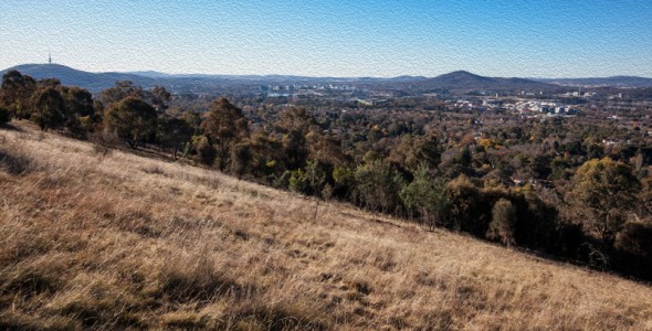
Red Hill late afternoon

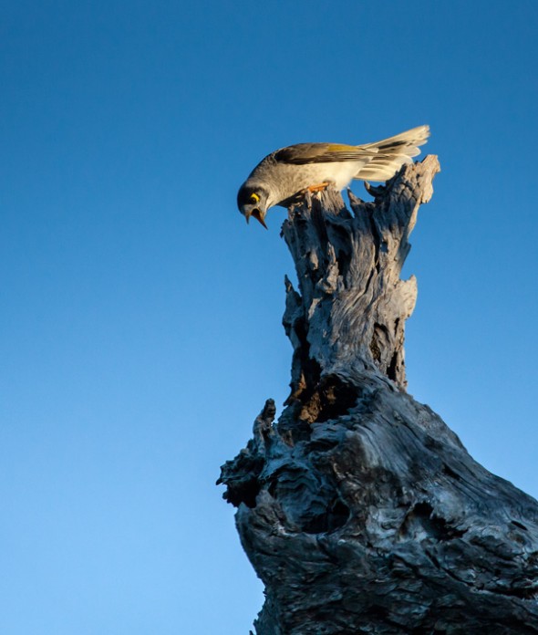
One of the pleasures of living in this ‘Garden City’ is that, even though I live in an ‘inner suburb’, I can walk a hundred meters to the end of my street and be deep in eucalypt bushland. Red Hill is also home to hundreds of eastern grey kangaroos, white cockatoos, gang-gangs, crimson and eastern rosellas, snakes, lizards, fairy wrens,… you get the picture. Of course there are also blackberry bushes, St John’s Wort and foxes too, but it’s still a relatively intact example of the original native bushland (thanks in large part to the volunteer work done by the ‘Red Hill Regenerators’ group).

I get up there as often as I can, sometimes several times in a week, to enjoy the bush, the city views, and the exercise involved in climbing up to the trig tower at the top of the ridge. It also offers lots of photographic opportunities…

Here are some photos from my walk up there a few days ago. lovely in the late afternoon light. You can see the full set of pictures on the main Jokar web site by clicking on this link.

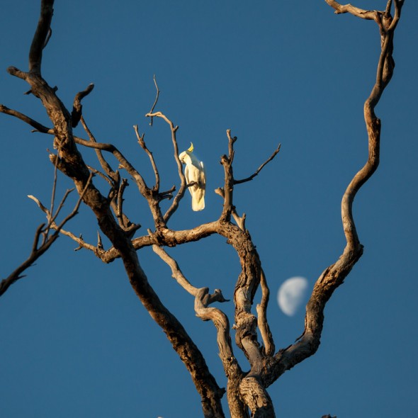
Sulphur-crested White Cockatoo (and the Moon)

Sulphur-crested White Cockatoo (and the Moon)

Red Hill view (oil paint filter)

Red Hill - view towards Civic

Mynah protects her nest from a magpie

Pixel Bender oil paint effect for Photoshop

There’s a number of ‘artistic’ effects filters that come as part of the Photoshop software (under the menu option ‘Filter’ in subfolders ‘Artistic’, ‘Brush strokes’ ‘Sketch’, ‘Stylise’ etc). By and large I try to avoid using them as I mostly don’t like the quite ‘processed’ image results that they produce. I do however make use of the Gaussian blur filter quite often (particularly when working to achieve flattering portrait skin tones) – and I have been known to apply a little of the ‘Poster edges’ effect to add some heavy clarity to edges on architectural shots. And then there’s the ‘Smart sharpen’ which I use almost routinely to crisp up RAW images – but I don’t really think of that as an ‘artistic’ effect.

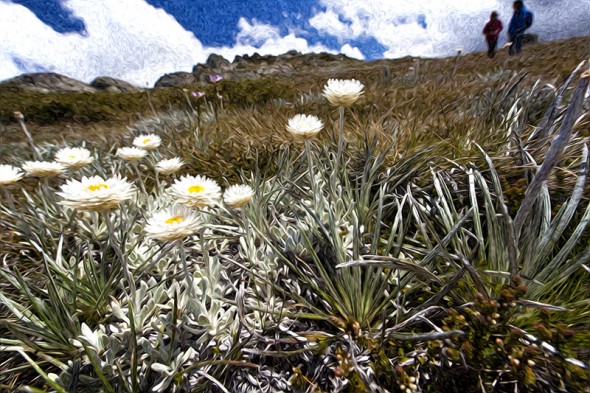
So, anyway – apart from all the exceptions (!) – I don’t use the filters much. However I’ve recently been having fun playing with the ‘Oil Paint’ filter that comes as part of the Adobe Pixel Bender filter gallery. The Pixel Bender Gallery isn’t installed by default with Photoshop CS5 – you have to instal the add-in which can be done from this link on the Adobe site. Once installed, you’ll find that you have a new folder of effects filters under the ‘Filter’ menu option. There are a number of Pixel Bender effects, including Kaleidoscope, RippleBlocks and TunnelView, but the most useful and most effective one (in my view) is the Oil Paint filter.

Ramsheads snow daisies

Snow daisies on the Ramshead Range

There are five sliders which you can use to adjust the intensity and other parameters of the Oil Paint effect (Stylization, Colorization, Cleanliness, BrushScale and BrushContrast) which give you plenty of control over the effect delivered by the filter.

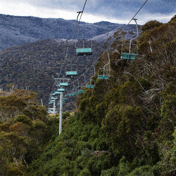
Thredbo chairlifts

Thredbo chairlifts

The effect can quite subtle, or can scale up to produce a quite Van-Gogh-like result if you prefer. I find that it can be particularly nice as an effect applied to images containing vegetation, producing silky elegant curves of smooth colour. Chances are that I’ll tire of the effect quite soon (!), but till then it’s a nice one to play with, and no doubt a good one to have the repertoire of effects for use from time to time.

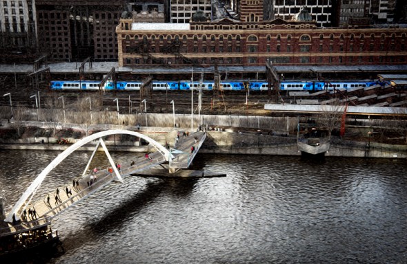
Yarra RIver

Yarra River bridge from Southbank

The whole issue of using effects filters on your images is an interesting one, with many photographers refusing to use this kind of image manipulation at all. They may consider the use of filters to be lazy or even ‘cheating’ – or they may simply just dislike the processed look of any images that don’t look 100% ‘natural’ (whatever that means!) Some of the debate and argument about the use of High Dynamic Range (HDR) techniques has a similar tone to it.

My own view is that it is in the end more of an aesthetic decision rather than a moral or purist issue. We are changing our images all the time by the decisions that we make, from the moment of choosing camera settings to capture the initial image, through to the range of post-processing techniques that may be subsequently applied. Post-processing effects filters are just one more option we have at our disposal in the toolbox to shape the final appearance of our images. The final judgment is whether it results in a visually compelling image for the intended viewer(s) – not how the image was produced. If those viewers look and think the result is too synthetic, ugly, clichéd or (worst of all!) uninteresting, then the image (or rather, the creator of the image) has failed.

Tasmania HDR

I still keep making High Dynamic Range (HDR) images. I can’t help it. This popular technique involves making a series (usually three or five) images with identical composition, usually on a tripod to ensure an exact alignment of the images. Each one is taken with the same aperture but with different shutter speeds so that you end up with images that may be 2 stops under-exposed, one stop under, ‘normal’, and one and two stops over. You can use auto-exposure bracketing if your camera supports it – but I have to change the settings manually on my camera to achive that range of exposures.

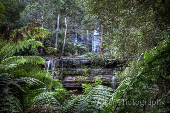
Russell Falls, Mt Field National Park

Russell Falls, Mt Field National Park


The images are then subsequently merged in post-processing software to create an image which incorporates the full range of light levels in the scene, without any areas of under- or over exposure. The result can be quite natural or quite dramatic, depending on your preference. I find that the technique can turn a scene with flat or uninteresting light into something quite compelling. It is also useful when the range of tones from dark to bright in the image exceed the limited range that can be recorded by the sensor of a digital camera.

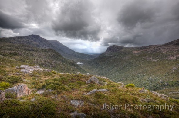
View from 'K' Col, Mt Field National Park

View from 'K' Col, Mt Field National Park


You can do the merging in Photoshop (CS5 has good HDR functionality), but I continue to use Photomatix which is a specialist tool for HDR imaging, offering a great deal of control over the appearance of the image created.

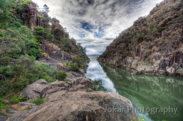
Launceston Gorge

Launceston Gorge


But the technique can be overdone – and often (perhaps usually!) is. It can difficult to resist punching up the local contrast or saturation levels to a point where the effect is hyper-surreal or oppressively garish. Oversaturated, grungy images, which one critic has referred to ‘Harry Potter photos’ are all over photo-sharing sites on the net, and have given the technique a bad name in some quarters. Used with discretion and moderation however, I think it can be brilliant. And sometimes it’s good fun to create that surreal effect.

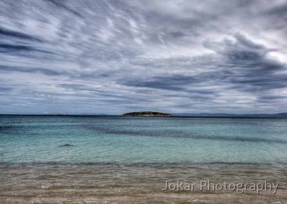
View from our campsite, Freycinet

View from our campsite, Freycinet


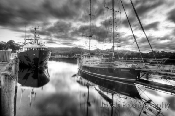
Strahan Harbour

Strahan Harbour

I’ll do some more posts about Tassy later, but in the mean time you can see other photos from Tasmania (only a few which employed HDR!) on my website in this folder. There’s also a folder with a number of other HDR images here. Hope you like them!